Process Stability Monitoring
Distinguishing Special vs. Common Cause
Six Sigma Control Phase

After Process Changes

Preventive Quality Control

Customer or Regulatory Requirements
Supplier Quality Agreements
Machine Qualification & Validation
Reducing Over-Adjustment (Tampering)

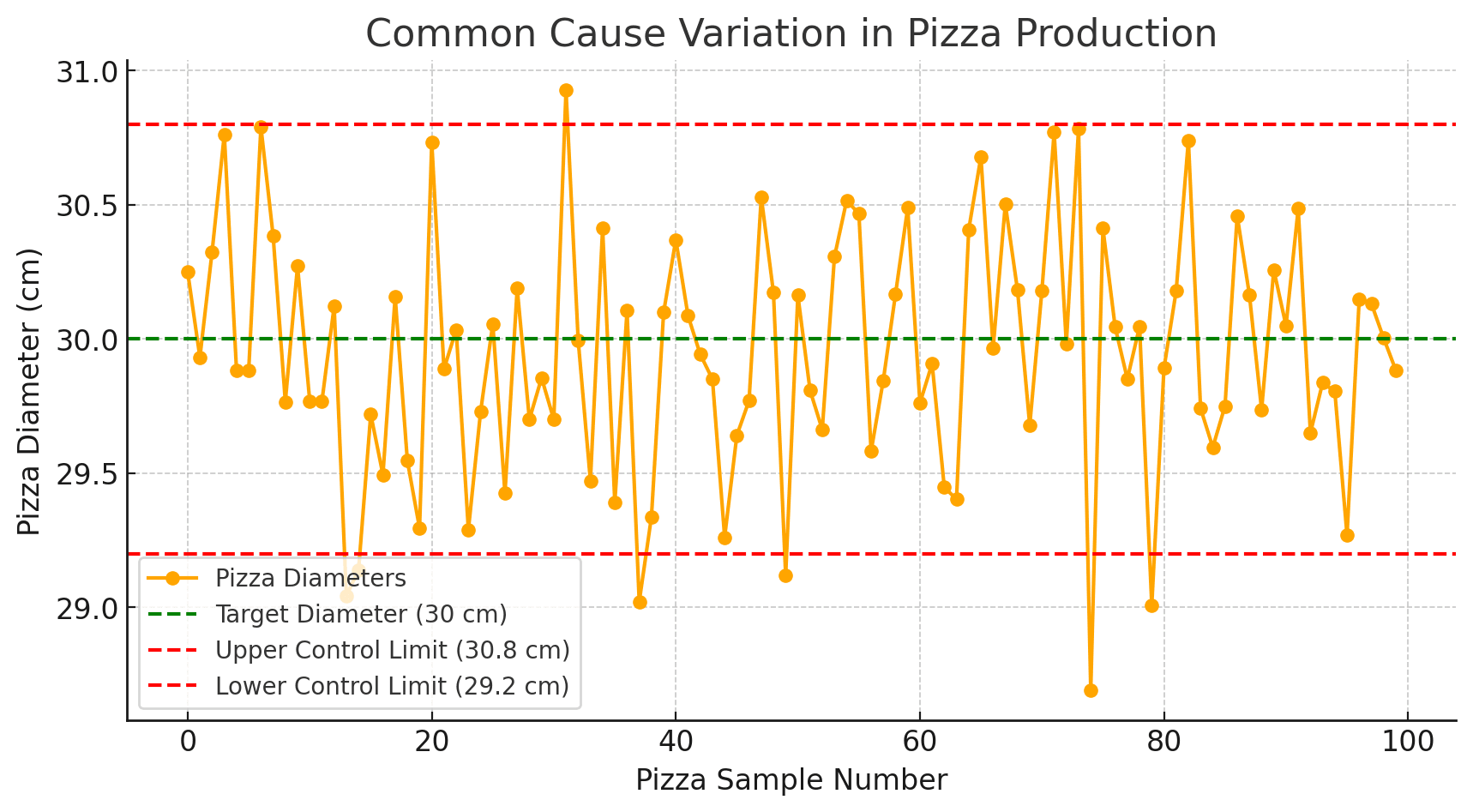
Common Cause Variation
Also known as "random variation," this type of variation is inherent in the process. It is natural, predictable, and always present to some degree.
Common cause variation is due to factors that are consistently and routinely part of the process. These could include slight differences in machine calibration, environmental conditions, or human performance.
Control charts help in identifying the extent of common cause variation and determining whether the process is stable (in statistical control).
This ends up providing organizations the definition of what is broken, or what could be made better resulting in effective planning and execution becoming a necessity — to aim all the efforts towards effective results.ess more efficient and effective.
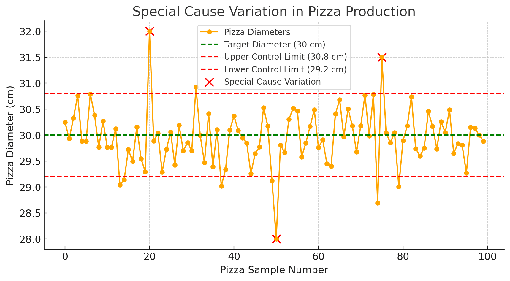
Special Cause Variation
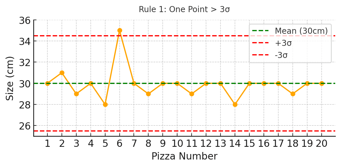
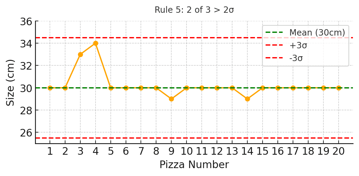
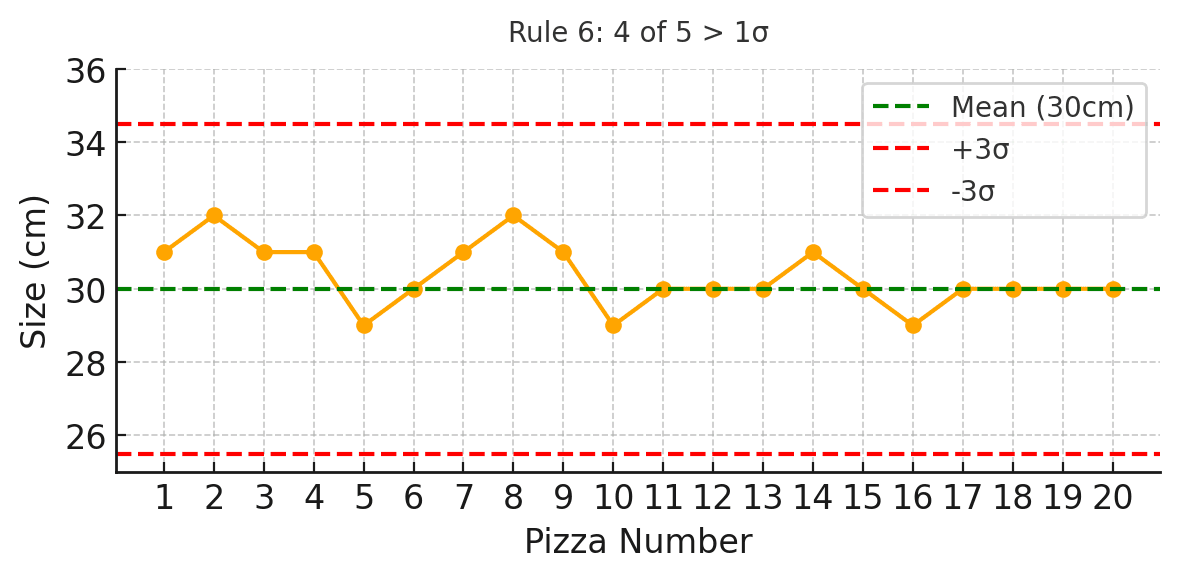
Special Cause Variation refers to anything that differs from standard practices, not an integral part of the process but something special, anomalous or situational.
For instance, a breakdown of the machine line you are attempting to measure is Special cause variation which cannot be predicted while Common Cause variation may result from factors like material quality, environmental conditions etc.
If a control chart suggests that the process contains special cause variation, then it means that the process is still not in statistical control and needs further investigation and need to be corrected.

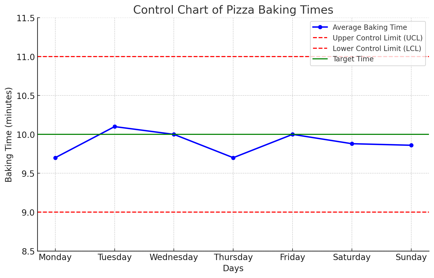
Stability and Predictability
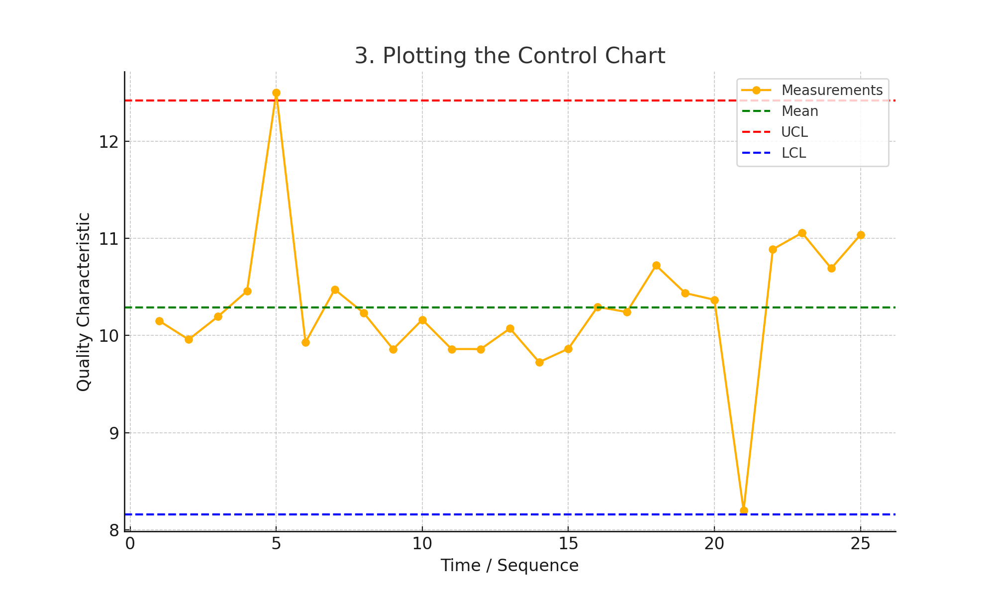
A process is known to be stable or in statistical control if it shows just common cause variation.
To check the stability of our process we use some control charts. A predictable process is one that has control limits and, based on the previous study… it looks determined to stay well within them.

Control Limits vs. Specification Limits
The control limits are statistically derived from existing process data, but they are not the same as specification limits (Upper and Lower spec limit) which are determined by customer requirements or design specifications:
- Control Limits are process-driven and show the natural variation in production.
- Specification Limits are customer-driven and define acceptable product sizes.
Variation ranges, reflect natural variation and specification limits indicate the allowable range of variation for the process output to meet customer expectations.


Ishikawa Diagram

5-Why Analysis

Pareto Chart

Histogram

Correlation / Scatter Diagrams

MSA / Gage R&R
Process Capability (Cp/Cpk)
Action Management

FMEA

Check Sheets (Tally Sheets)

8D Report

OEE (Overall Equipment Effectiveness)
Control Plan

CAPA Management
Alerting to Process Problems Before They Snowball
Process Consistency

Enable Continuous Improvement

Minimize Waste and Maximize Efficiency

It does require some basic statistics knowledge

Incorrect conclusions based on misinterpretation

Not Ideal for high variability processes


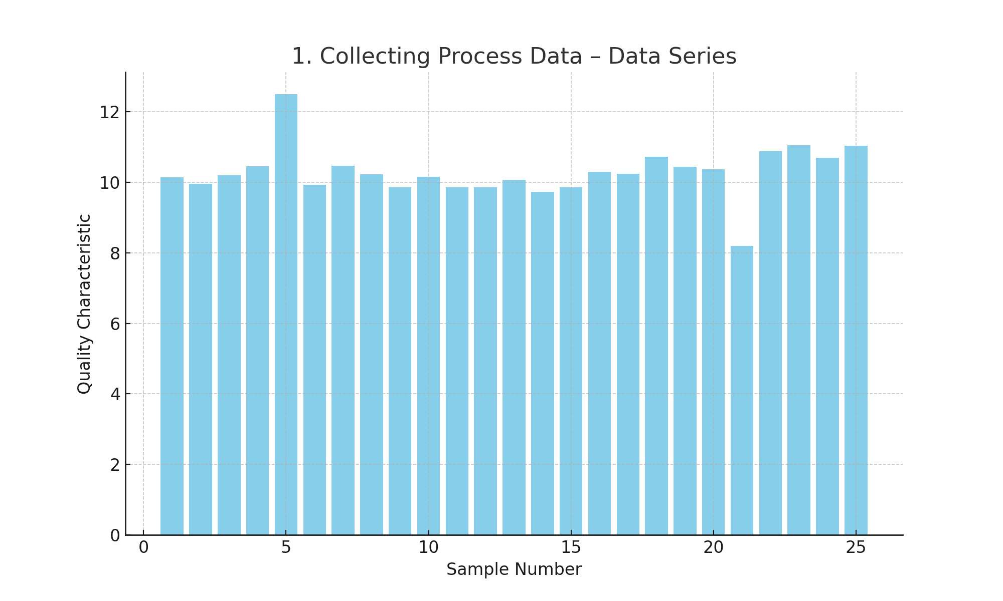
Make data clean and relevant.
Control charts only work as well as the data chosen to build them. The data collection techniques needs to be quite strong and reliable. This involves establishing the accuracy of measuring devices, that data meets quality criteria and that it is representative of the process operating under normal conditions.
Prevent biases or errors in data-collection. For example, the accuracy of the data on which control charts are based can be substantially increased in a production process by using calibrated instruments and making sure that people who record the data follow correct data recording methods.

Update And Review Control Charts Frequently
Keep in mind that control charts are not static set-and-forget tools, they need to be updated and reviewed on regular bases. It consists of periodically adding new data to the plot, retaking control limits and verifying how the process is performing. Regular reviews lead to early recognition of the changing trends or process.
When the process or methods of production have changed, it is necessary to review this control chart and ensure that they reflect the current state of monitoring the process. In practice, having regularly scheduled updates and reviews of control charts will ensure continuous monitoring and improvement in the process.

Integrate with Other Various Quality Tools for Comprehensive Analysis
Control charts are powerful, but the power of a good control chart increases when it is supported by other quality tools. Control charts combined with tools such as Pareto charts, cause-and-effect diagrams and process flowcharts offer a fuller picture of the process and its variances. In this process, we have a more sophisticated way to analyze and understand the root causes of variations in the system using the combined data from these 2 segments.
For instance, if a control chart shows a change in process performance, then performing root cause analysis can be used to easily use fishbone diagram as it helps the root causes leading to the shift. This is achieved through the use of a multi-tool approach, which provides a greater level of understanding in process behaviors and systems, leading to better quality improvement. process more effective and sustainable.