Why Quality is Survival
Use the 80/20 rule to identify which 20% of issues cause 80% of your problems. This video demonstrates the 5-step Pareto Chart process: collect data, organize by frequency, calculate cumulative percentages, create the visual chart, and focus on the "critical few." See how fixing just 3 issues reduced complaints by 70% without hiring staff or major investment.
You'll learn: The 80/20 principle • 5-step chart creation • Data-driven prioritization
Video Transcript
Have you ever stared at a mountain of problems and felt completely stuck on where to begin? Maybe you're running a business, managing a project, or just trying to fix daily annoyances.
Imagine transforming chaos into clarity with just one powerful tool. Welcome to the world of Pareto Charts, the problem-solving secret that top companies like Toyota, Apple, and Amazon use to achieve remarkable results with minimal effort.
In this video, you'll learn how to identify which 20% of issues cause 80% of your problems. The step-by-step process to create your own Pareto chart and how to apply this technique to any business or personal challenge.
The Pareto chart is a special kind of graph. It looks like a bar chart and a line graph mixed together. As for how it works, well, it follows something called the Pareto principle or the 80/20 rule.
The Pareto principle discovered by economist Vilfredo Pareto in 1896 observed that 80% of Italy's wealth belong to just 20% of the population. This mathematical pattern appears everywhere.
80% of software crashes come from 20% of the bugs. 80% of sales typically come from 20% of customers. According to this rule, 80% of the problems usually come from just 20% of the causes.
The brilliance of this principle isn't just recognizing the imbalance. It's leveraging it to create maximum impact with minimum effort.
And that's because the Pareto chart combines vertical bars representing individual problem frequencies (left axis), line graph showing cumulative percentage (right axis), and clear 80% line highlighting the critical few issues.
But how do you go about using this graph to solve your problem? Well, here are the steps. Don't worry, I'll go over each step using the Zero Defect Pizza example.
So, the first thing you need to do is collect data. It's pretty straightforward. In our case, the manager at Zero Defect Pizza notices that the customers are unhappy.
And so, he has the staff write down every customer complaint for a whole month. They record things like, "My pizza took too long to arrive. I got the wrong order, and my pizza was burnt."
After collecting all the complaints, they count how often each problem happens. This way, they'll end up with a data set that is going to look like this.
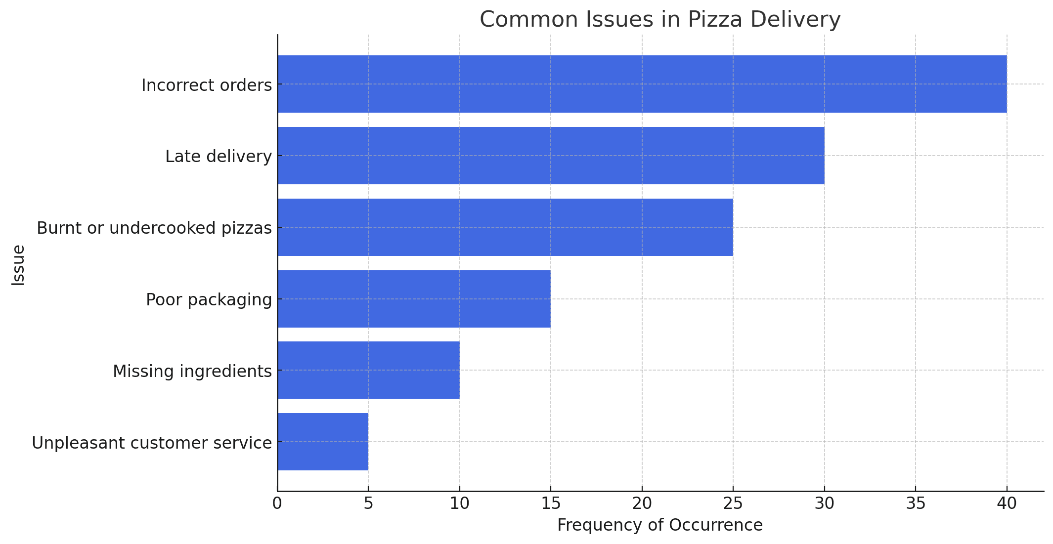
Issue: frequency of occurrence. Incorrect orders: 40, Late delivery: 30, Burnt or undercooked pizza: 25, Poor packaging: 15, Missing ingredients: 10.
Once you have your data, the next step is to organize it. The manager is going to group the problems into categories and order them from most common to least common. The idea is to focus on the biggest issues first.
Now, by looking at the rearranged table, anyone can easily tell that the biggest problems at the pizzeria are incorrect orders, late deliveries, and burnt pizzas.
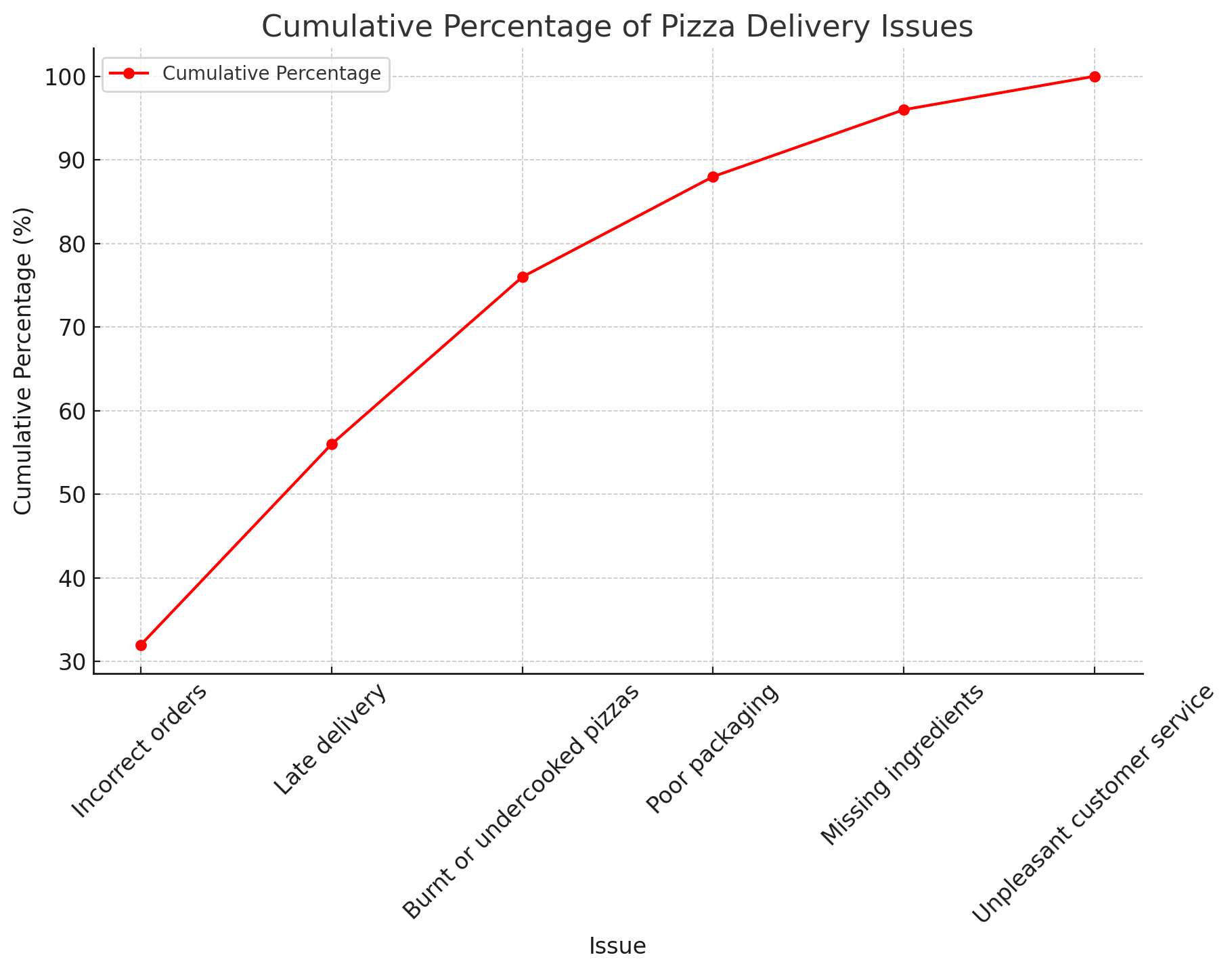
With that out of the way, it's time for the third step, calculating the cumulative frequencies in order to identify the so-called critical few.
Once you do that for all the categories, you can move on to your fourth step, creating the Pareto chart. And no, you don't need to take AP maths for this.
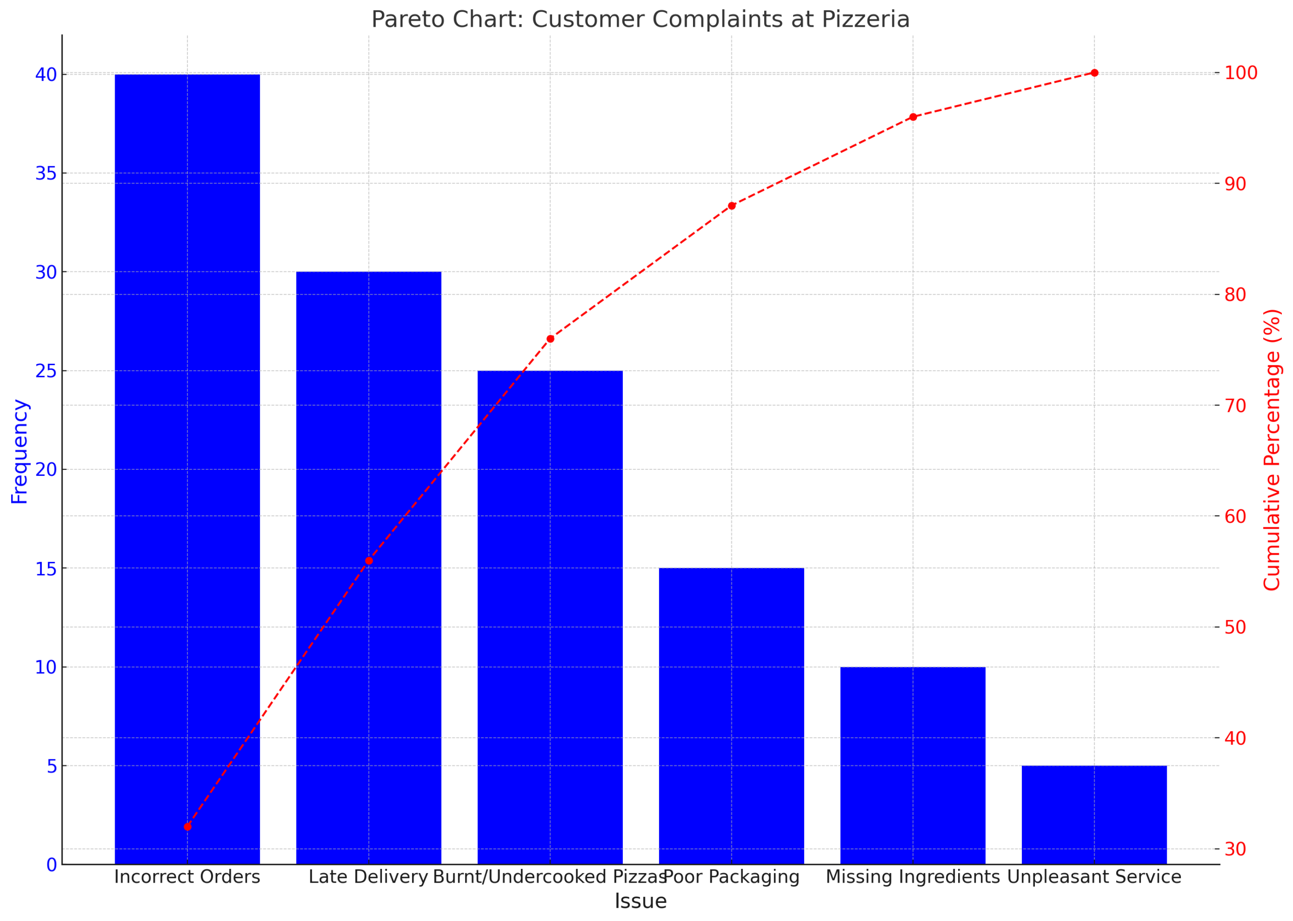
Each problem is represented by a bar on the graph. The taller the bar, the more often that problem happens. Then a line graph is drawn over the bars to show the cumulative percentage of problems.
This is what you should end up with. One look at the graph and you can easily tell that the top three issues, also known as the critical few, make up almost 80% of all complaints.
That means if the pizzeria fixes just those three problems, they'll solve most of the customer issues. And this way, you have a structured breakdown of what you should be tackling.
Obviously, the next step is tackling these problems one by one. The manager can take steps like double-checking every order before sending it out, better time management, and fixing the oven temperature.
After 60 days, he observes that total complaints dropped by 70% while customer satisfaction scores increased by 35%. All without hiring additional staff or significant capital investment.
This way, using the Pareto chart, you can make the biggest improvements without wasting time or resources on tiny issues. And that's this method's biggest strength.
It saves time and effort. It's based on real data, and it improves overall performance.
But there are a few limitations to using the Pareto chart. As beneficial as it is to simplify things, the Pareto chart might do too good of a job at it.
The downside: issues that are minor but equally important are brushed under the rug. Some rare problems can have catastrophic consequences. Also, as you solve top issues, new patterns emerge.
Finally, the Pareto chart represents a data set at one point in time. For more accurate and updated results, you would need to update the chart regularly.
Just keep these limitations in mind while you're using the Pareto chart and you'll be good to go.
The Pareto chart isn't just a graph. It's a mindset shift from fixing everything to fixing what matters most. So you don't have to solve every issue to make dramatic improvements. Start with the vital few and watch your results multiply.
Would you consider this chart and for what purpose will you use it? Let us know in the comment section below.
What
A Pareto Chart is a graphical tool used in quality management and statistical analysis, combining a bar chart and a line graph. Each bar represents a specific issue or cause, ordered by frequency or severity. The cumulative impact is illustrated by the line graph, emphasizing the most significant factors.
Pareto Charts are named for the Pareto Principle that is commonly described as ”80% of effects come from 20% of causes”.
Around 20% of people control about 80% of the wealth. This isn’t a strict rule but rather a general pattern observed in many societies.
In quality control, it’s often observed that 20% of causes (such as defects or process issues) lead to 80% of the quality problems. By focusing on these critical 20%, organizations can achieve significant improvements in quality.
Understanding the Pareto Chart
This video explains how the Pareto chart helps you find the small number of causes that create most of your problems. You learn how to read the chart, spot real trends, and focus on the steps that give the biggest impact. The video shows how this method cuts noise and guides you toward smart, effective actions.
Pareto Charts: Find the Vital Few Causing Most of Your Problems
Your Pareto Quick Guide
This guide shows you how to use the Pareto method to find the few causes that create most of your problems. You learn how to read the chart, set the right focus, and choose steps that give the greatest impact. The guide helps you work faster and make better decisions in daily tasks.
The Pareto Animal Farm Framework
This guide shows you how to use the Pareto idea in a simple, visual way. You learn how to spot the few problems that cause most of the damage in your process. The guide helps you sort issues, set the right focus, and cut waste by working on the problems that matter most.
Test Your Pareto Knowledge
Check your skills with 10 simple questions about the Pareto method. The quiz helps you review key ideas, spot gaps, and track your progress. It’s a quick way to make sure you understand how to find the few causes that shape most of your results.
When
Pareto charts are a common data visualization tool that is used by different industries for quality control, determining the most important factors in datasets, and guiding improvement efforts.
Why
The primary goal is to highlight the most critical factors in a process or system, enabling targeted quality improvement efforts.
Principles

Pareto Principle
The 80/20 rule ('The Pareto Principle') is a standard concept in quality and economic management theory which says that roughly 80% of effects come from 20% of causes.
This principle posits that, in a multitude of examples, 80% of the result is typically produced by less than 20% of factors.
For example: in business, 80% of sales could be from 20% of customers or in a software project, 80% of errors could apply to 20% of the bugs.
This leads to identifying and ranking the most important ruining factors that in turn results to optimal allocation of resources. It brings up the asymmetry that one tends to observe in cause and effect distributions, and tell managers and analysts to recognize that they need only heed the inputs required to produce the big results.

Focus on Critical Issues
The importance of concentrating on vital issues is a cornerstone in high-quality management, highlighting the requirement to concentrate attempts around the largest effect places.
The idea behind this is that not all the problems are as related to each other. Furthermore, when companies analyze and solve the problems or processes that constitute their highest priority, there is more bang for the buck. The principle is related very closely to the pareto 80/20 rule, focusing on the few causes that create most of the problems or defects. It allows the company to conserve time, manpower, and money in areas that are not as impactful to quality and performance but be focused on places that will make more of an improvement.

Data-Driven
The principle behind this is clear as data will trump our social assessments every time, and we cannot profess to be objective if we do not have the quantitative evidence on which to base our position.
In the world of quality management, that translates to: making decisions based on data and statistics rather than gut or hearsay. Through methodical data collection, analysis and interpretation organizations can realize an objective understanding of their processes and highlighting where improvements are needed. It allows us to see the symptoms as symptoms, not simply problems, and this scientific view of problems will help localize solutions. Identification of trends, patterns and causal relationships: In the absence of empirical evidence and data-driven analysis formation effective strategies can become challenging.
This principle drives home the point that only quality data is power – to make appropriate decisions in advancing quality improvement initiatives.
How To
1. Collect Data
The first step in creating a Pareto Chart is to collect relevant data on issues or defects.
This requires a systematic collection of data on what is occurring in the operation and recording it. Thus, for that purpose or the only reason we are spending our research time just collecting all suitable data to get accurate and unbiased results of the issue in hand. Keep track of the type of every issue and bug, but — if you can — also how often each occurs and (when applicable) where it ends.
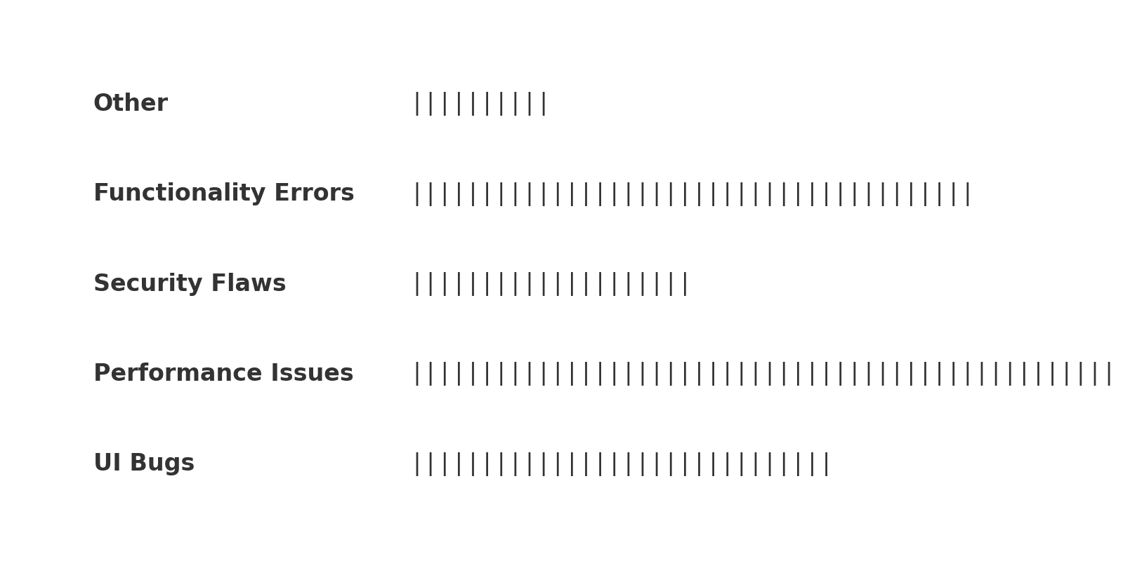
Types of data might include historical records, quality control logs, customer feedback or direct observations. Or just use a simple Check Sheet / Tally Sheet like beside:
2. Categorize Issues
Once all data is collected, place them into bins.
This means you can think of different problems or defects as either being similar in nature (nature) or related to some underlying issue (root). The analysis can become complicated task, this gets simplified when similar analysis is grouped together to form category. These categories must be mutually exclusive and collectively exhaustive, so that any issue fits into exactly one without overlapping anything else.
This is important because this will help you pinpoint the areas in which patterns and factors are quite similar, which means they should be taken into account when we aim to tackle them.
3. Order Categories
These categories are ordered based on how frequent they are after calculating the frequencies.
This order is important because it directly affects the interpretation of the Pareto Chart as it visually reveals how significant each category being analyzed truly is. Columns from the left to right: present (high frequency) categories, through less frequent categories on its right. This ordering allows them to identify the 20% – “the vital few” — relatively easily: only a small number of categories will cover most of the problems.
4. Create Chart with cumulative Line Graph
This process step will end up in the creation of a chart with bars for frequencies and a cumulative line graph.
A bar depicts each category, and the height of this bar denotes the number of issues within that category. The chart also overlays the cumulative percentage of issues as a line on top of the bar chart. This usually has a range on the left y-axis and cumulatively to the right y-axis; working as a graph where for each point, its value indicates the sum of issues covered by categories left. This resolution shows not only the top categories but also gives a sense of the total effects among less common issues.
5. Analyze and derive Actions
Look at the Pareto Chart to see which would be the ‘vital few’ categories that are worth addressing.
Part of this includes interpreting the chart to find out which categories drive most of the issue and are therefore higher priority. The analysis is made on the left-most categories with which (according to Pareto Principle) we would likely get everything accounted for. At the same time, keep an eye on what the distribution looks like as a whole and check for any odd patterns or outliers. This analysis informs decision-makers about how and where to target improvements that can be most effective and efficient.
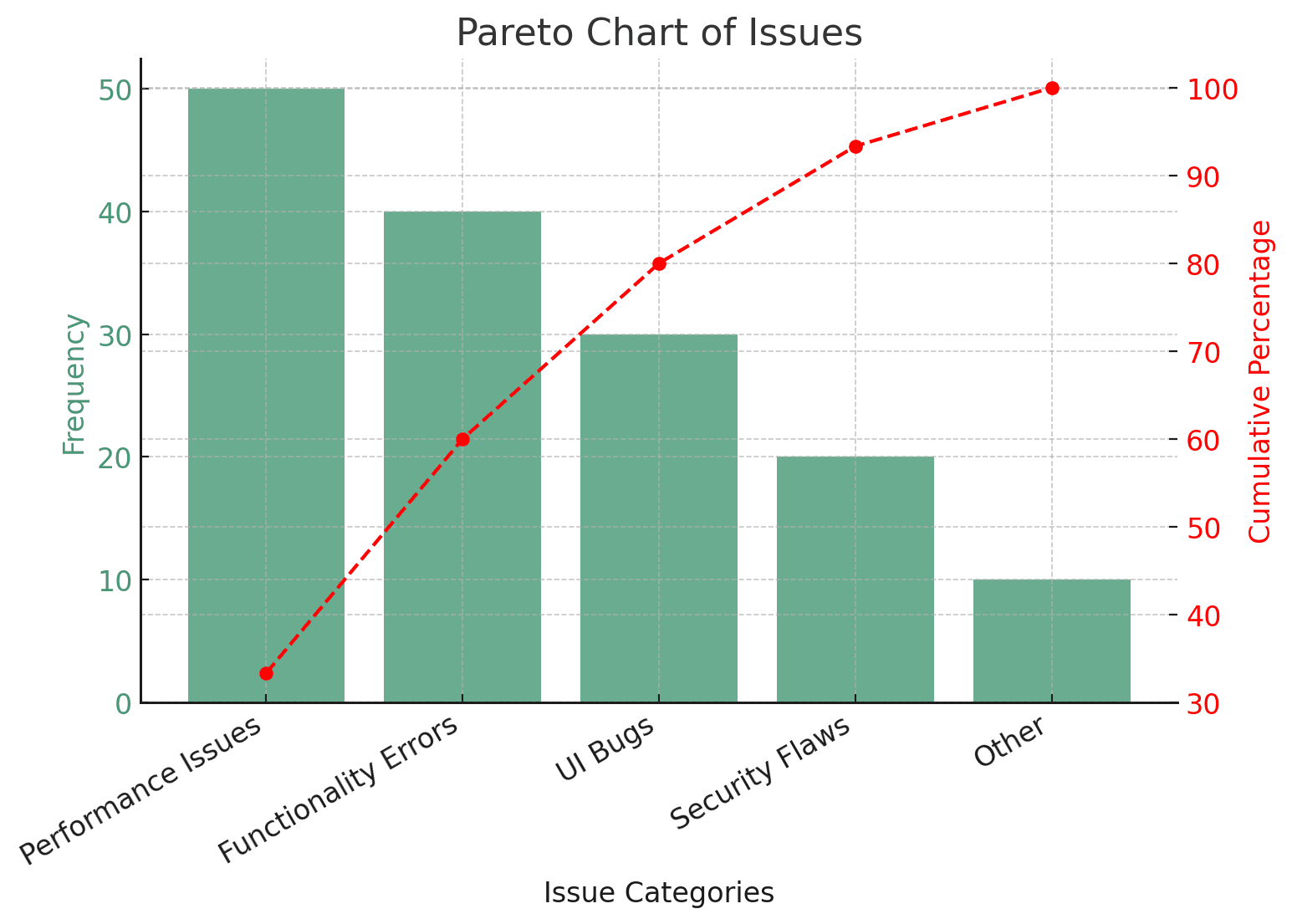
Recommendation based on Analysis of data above:
- Prioritize Performance Issues and Functionality Errors: Addressing these will yield the highest improvement in product/service quality.
- Reduce UI Bugs: Enhancing user experience through better UI design and testing.
- Monitor Security Flaws: Though less frequent, security concerns should not be ignored.
- Optimize Resources: Allocate effort based on issue frequency—focusing on the biggest contributors first.
- Reassess Low-Frequency Issues: If time and resources allow, consider improving minor defects after resolving major ones.
Benefits
Effectiveness: Zeroes in on main issues
The strength of the Pareto Chart is in focusing resources and efforts in attacking the most important problems. It allows the organisations to focus in the few causes that will bring disruption and obliterate vast majority of problems. Rather than dividing resources equally among all problems, the Pareto Chart helps decision-makers focus on which problems need their time, people and money most. This focused strategy not only enhances the efficiency of problem-solving efforts but also make use of resources adequately thereby offering enlarged productive operations and fast resolutions to massive problems.

Clarity: Visual representation aids understanding
The Pareto Chart creates an image of data that can be interpreted without abstracting a complicated reality. The bar and line graphs are useful separately, but when combined, they provide a clear and immediate understanding of the spread of issues. It reinforces which problems are either most common or most severe relying on visual cues to read an interpretation quicker and more accurately. Having this clarity in part of our life is especially important in relaying results and next steps with a larger community, some who may not understand technical jargon. A Pareto Chart the clear visual representation of abstract data that helps in aligning team together and making decisions.

Versatility: can be applied across all Industries
It can be widely applied because the Pareto Chart is versatile. This tool is not limited to any particular industry or problem set. Whether used in manufacturing to find production defects, customer service to sort complaints, or blue-collar work to prioritize patient problems, Pareto Chart is still practical. The concept of pinpointing the most effective factors to streamline is universal in nature. The adaptability of a pareto diagram to use it as quality improvement and problem-solving tool make it irreplaceable for the professionals in several fields.

Prioritization: Based on Impact, it helps to set priority.
The benefit of creating a Pareto Chart is that it helps to prioritize. This provides a way for organizations to prioritize fixes based upon the impact of various issues. It visually differentiates the big problems from the small ones — directing managers’ and teams efforts to where they will have the biggest effect. This prioritization is crucially important in environments where resources are scarce and to a certain extent, decisions have to be made quickly. Lesser priority stuff are avoided and only efforts that seem to strike at the heart of issues — mattering most where it mattered more-seen as being manipulated there-effectively.

Limitations
Over-simplification: Overlooks Low-Occurrence but Relevant Problems.
One weakness the Pareto Chart may have is over-simplifying. This hinders from seeing less common, but equally having impact issues. When concentrating on the ‘vital few’ causes quality managers may run the risk of overlooking the ‘trivial many’ (those that cumulatively could have a big effect or are key issues in specific local contexts). This can be especially difficult when rare but catastrophic failures exist. This may result in the rare events being down-played and overlooked, because of them not being listed at the top, which could significantly deter the long-term effects on your processes.

Data Dependency: Heavy dependance on data avaiability & accuracy
The accuracy of a Pareto Chart can be skewed by poor data quality and availability. As is often the case this reliance can also be counterproductive, because a good chart is only as credible as the data behind it. Misleading results, false assumptions and wrong focus areas are very easy to come by when running analyses on incorrect data. Data collection- as long as the processes for each element within are solid across all relevant dimensions of the issue most often lies in. This limitation is especially pernicious in the case where data is sparse (or difficult to quantify, or easily interpreted based on one’s desires), and could bias how various issues appear on the chart.

Static Analysis: Fails to capture evolution as a function of time if not periodically updated
What else is limitations in the Pareto Chart — it gives static analysis only, tells what happened and not necessarily what might happen. It does not by default show time trends and the analysis can get stale quickly without frequent updates. However, this static nature can be a disadvantage in a dynamic environment, where the significance of problems are continually changing and require resolution. However, simply closing the Pareto Chart is difficult because we have to monitor this ongoing and update it periodically — which can be very expensive in terms of resources. This need of continuous follow-up and analysis of data can be difficult, especially in high-paced or resource-poor conditions.

Best Practice

Regular Updates: Chart Continuation With New Data
Pro Tip: If you do use a Pareto Chart, make sure to update it regularly with new data. As it is common with Pareto, this chart represent a snapshot of the distribution and it needs to be updated once in while based on the fluctuation in data over time. This updated allows for the chart to stay current and reflective of reality so it can identify if there is a new issue or if an issue comes up more often. Revisions in dynamic environments: Dynamic, fast-paced environments with changes that can occur rapidly especially require regular revisions. Being up-to-date helps in continuously keeping the focus on the latest and most important challenges and, therefore, responding timely and correctly.

Comprehensive Data Collection: Capture all Necessary Data
Collect as much data as possible to yield the most effective and accurate Pareto Chart. And by this, I mean collecting data that is not just thorough but also comprehensive on all the dimensions of what you are looking at. Biases in data collection, whether intentional or accidental, can distort the study outcome and result in misinformed decisions. This essentially means that the more exhaustive and comprehensive the data collection process, with all relevant variables accounted for, makes a Pareto Chart much clearer and reliable. Instead of the scattered approach to data collection, as showcased in other municipalities, this breadth of information makes for a broader analysis and thus more useful solutions.

Comprehensive Data Collection: Capture all Necessary Data
When working with a Pareto Chart, the chart must be seen in context during a contextual evaluation of the entire system or process being studied. This means understanding what these issues reflect about something bigger than just the data on the chart. Consider factors like relationships between issues, the broader organizational context and external influences. It keeps the interpretation of a chart from being made in a vacuum, and as such can help prevent decisions that are good at one thing but bad for another. By analyzing the context, you can increase strategic impact of this Pareto chart which results in much brighter and consistent improvements.
Pizza-Example
Problem
Zero-Defect-Pizza pizzeria is tracking customer complaints over a month to improve operations.

1. Collect Data
Zero-Defect-Pizza identifies several recurring problems and counts how often they occur.

2. Categorize Issues and 3. Order Frequencies
Zero-Defect Pizza categorizes the customer feedback and sorts it by the frequency of occurrence:
4. Calculate cumulative percentages
Zero-Defect Pizza calculates the cumulative percentages:
FAQ
What is a Pareto chart / diagram in quality management?
A Pareto Chart is a graphical tool used in quality management and statistical analysis that combines a bar chart and a line graph. Each bar represents a specific issue or cause, arranged in descending order of frequency or severity. The cumulative impact is illustrated by the line graph, emphasizing the most significant factors.
Pareto Charts are based on the Pareto Principle, commonly referred to as the 80/20 rule, which states that 80% of effects come from 20% of causes.
What is the 80-20-rule?
Pareto Principle (80/20 Rule):
Roughly 80% of problems come from 20% of causes, helping organizations focus on the most impactful factors.
When is a Pareto chart / diagram used in quality management?
Pareto charts / diagrams are used to analyze data sets to find the most common causes of defects or issues, primarily in quality control and process improvement initiatives.
When is a Pareto Chart used?
Pareto Charts are widely used in different industries for:
Quality Control – Identifying major defects or errors in production.
Business Analysis – Prioritizing problems in service delivery or product performance.
Operations Management – Identifying inefficiencies and focusing on impactful improvements.
Customer Service – Analyzing customer complaints to improve satisfaction.
What is the objective of using a Pareto chart / diagram in quality management?
The main objective of Pareto charts / diagrams is to highlight the most critical factors in a process or system, facilitating targeted efforts for improvement in quality management.
Why is a Pareto Chart important?
The primary goal of a Pareto Chart is to highlight the most critical factors in a process or system, enabling targeted quality improvement efforts. It allows organizations to:
Focus resources on the most significant issues.
Improve efficiency by addressing the root causes of problems.
Make data-driven decisions instead of relying on intuition.
What are the principles of a pareto chart / diagram?
Pareto Principle (80/20 Rule) – Roughly 80% of problems come from 20% of causes, helping organizations focus on the most impactful factors.
Focus on Critical Issues – Concentrating efforts on high-impact areas leads to more efficient problem-solving.
Data-Driven Decision-Making – Ensures that improvements are based on measurable evidence rather than assumptions.
How is a pareto chart / diagram created?
1. Collect Data
Gather relevant data on issues, defects, or factors affecting performance. This can include quality logs, production reports, customer complaints, or historical records.
2. Categorize Issues
Group similar issues into categories based on type, cause, or impact.
3. Calculate Frequencies
Count how often each issue occurs within a given timeframe.
4. Order Categories
Sort categories in descending order, with the most frequent or severe issues first.
5. Create the Chart
Draw bars to represent each issue’s frequency.
Add a cumulative percentage line to show the total impact.
6. Analyze the Chart
Identify the “vital few” issues that contribute to most of the problems and prioritize solutions accordingly.
What are the benefits of a Pareto chart/diagram?
Effectiveness – Focuses efforts on the most significant issues.
Clarity – Provides a clear visual representation of problem areas.
Versatility – Applicable across various industries and use cases.
Prioritization – Helps set priorities based on data, not assumptions.
What are the limitations of a Pareto chart / diagram?
Over-Simplification – May overlook low-frequency but critical issues.
Data Dependency – Requires accurate data collection for meaningful results.
Static Analysis – Needs regular updates to reflect changing conditions.
What are best-practices for a Pareto chart / diagram?
Regular Updates – Ensure the chart remains relevant by updating it with new data.
Comprehensive Data Collection – Capture all necessary details to get an accurate picture.
Contextual Evaluation – Consider broader factors influencing the data to make informed decisions.
What isan example of a Pareto chart /diagram in a quality context?
In a manufacturing scenario, a Pareto Diagram might reveal that 80% of product defects come from just 20% of production processes. By focusing on these key areas, significant improvements in product quality can be achieved.


